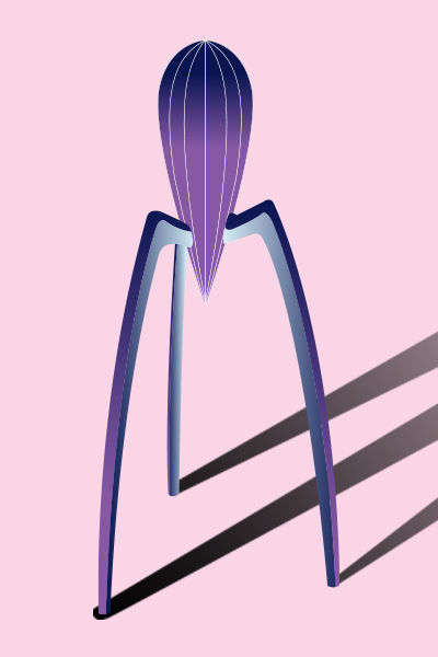
When we think of design, we often think of fashion design. However, while fashion design leans more towards art, graphic design is first and foremost a communication tool. As Frédéric Metz, former director of UQAM's Centre de Design, once said, " Good design is where form meets function ". An example that illustrates this phrase would be the citrus juicer by the great industrial designer Philippe Starck.
It's at this intersection between beauty and efficiency that your communication tools should take root. If you're not sure how to tell good design from bad, here are a few tips to get you thinking.
1. Make sure your content is readable:
Your texts must be easy to read. To achieve this, make sure they are large enough. A font size of 16 points is usually recommended.
The contrast between important elements and their background must also be sufficient. Here's a little free tool that will help you easily check contrasts: https://webaim.org/resources/contrastchecker/
2. Create a visual hierarchy :
As with text, the structure must indicate to the user the importance of the elements. If you do some research on the subject, you'll come across the term " F layout " or " Z layout ". Above all, remember that the important thing is to direct the user's eye to the desired action (purchase, newsletter subscription, etc.).
3. Don't be afraid of blank space:
The graphic void allows your visitors to rest their eyes. Viewing your pages will therefore require less effort for them, and their concentration will be better and last longer. What's more, spacing out elements makes them easier to distinguish, so you avoid repeating information that's already on your website.
4. Think responsive:
With telephone consultation sometimes exceeding that on computers, responsive design is no longer a nice addition. Keep in mind that your page won't look the same to everyone. Avoid images that are framed too tightly, as you could end up with partially or totally cropped heads. Justified alignments of text are also to avoid.
5. Create clickable buttons:
The famous white button on a white background, outlined with a thin line, is nice to look at, but not very effective. Your buttons must be visible. You need to know that it's a clickable element. Avoid transparent backgrounds, stylized fonts and make sure you have the different states of the button (normal, hovered and clicked). Your action buttons are your bread and butter, so make sure they're visible.
6. Allow yourself to do tests
As no one is perfect, A/B testing is the best way to refine your pages. Change only one variable at a time if you want meaningful data. If you want to go a step further, tools like Hotjar will let you see what's most viewed or clicked on your pages, or even how a visitor behaves while browsing your website.
With these few tips, you should be able to take a critical look at your website, whether you produce it yourself or commission an agency to do so. A site isn't a brochure, so it's easy to make changes if it doesn't quite live up to your expectations. Finally, don't forget that the best design isn't always the most effective!
Thanks and talk to you soon,
![]()
Jonathan Roy
Customer Experience Manager
