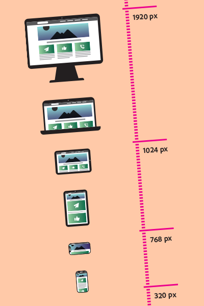
À l’heure où le téléphone intelligent est pratiquement un prolongement de l’humain, il est important de considérer ce média, ainsi que les autres, lors de la création de vos outils de communication numérique. Le « responsive design », aussi appelé adaptive design, is one of the most important aspects in ensuring that your message reaches the widest possible audience.
This concept takes into account the most common media, such as cell phones, tablets and desktop computers, but also all the formats in between, as well as those outside this scope, from the smallest to the largest.
Some food for thought
- Le « responsive » fonctionne par colonnes et rangées, comme un tableau. Une image disposée à la droite d’un texte sera alors relayée sous ce texte dans un format plus petit. Si ce n’est pas ce que vous désirez, sachez que plusieurs outils de gestion du contenu (CMS) vous permettent de gérer indépendamment la disposition pour chacun des trois outils nommés précédemment.
- If you add links or buttons, make sure they are not too close together. Two links that follow each other can end up directly under each other in a different resolution. This is not the ideal layout for users to easily click on the right link.
- As a window gets smaller, text takes up more and more space, while a picture takes up less and less. As a result, perfect alignment of a photo with juxtaposed text is virtually impossible, and can instead create unsightly gaps.
- Removing content, although simple to do, is disadvantageous from an SEO point of view. Avoid affecting your SEO by always giving priority to adapting your content rather than removing it.
Finally, if you can simplify your layout, do so. The simpler your layout, the easier it will be for you to manage the different versions.
Thanks and talk to you soon,
Jonathan Roy
Customer Experience Manager
